Essential Elements That Make a Website Attractive
There is quick evolution of website design strategies in the recent time just like effective game plan policies of other technology driven niches. Designing a website seems to be a simple task. However, many aesthetic and technical details require a lot of focus and awareness. The latest trends of website design ease in the customers spending a lot of time on your website. Follow these simple tips and generate a lot of traffic that actually gets converted.
Flat User Interface
In the current trends, having a flat UI is the most favored web design. This should be clear and simple and addition of aesthetically appealing colors should be done. The flat User Interface was introduced by Apple in the iOS 7 while the Microsoft has been using the Metro UI from past some time.
The use of the Flat UI by the 2 most important international tech trendsetters suggests that it must be implemented by you too!
Responsiveness
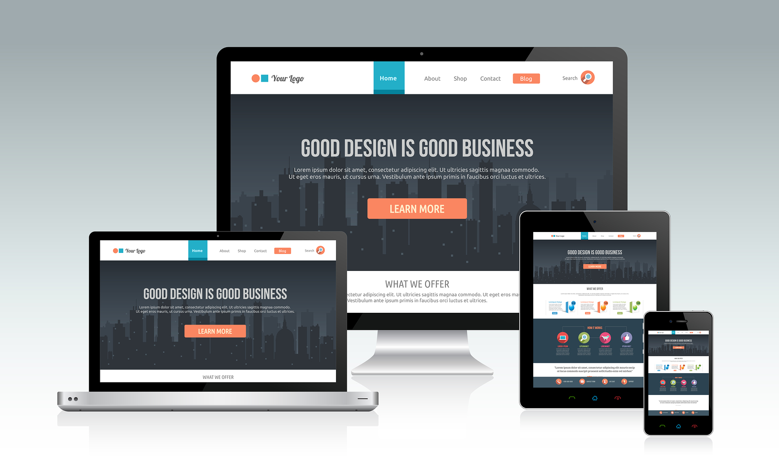
The responsiveness of the website has become most important criterion now than ever. In fact, this is most essential factor to be implemented in websites. You must ensure the website is easy to access and navigate even on a mobile device as much as it is on a desktop.
Content is The King
Relevant content and website design that makes the users get answers to their questions through easy accessibility options is what makes them spend more time on your website. Publishing white papers, case studies and articles carrying topics that would interest and engage the users serves as a great benefit.
Saying it through videos
Reading is only one part of communication users prefer. Making videos with relevant information is a faster and economical way to keep your audience engaged. In fact, many users prefer o see a video than reading large chunk of information.
Following a Minimal approach and saying it with Clear Pictures
Keeping minimal is the latest trend is the latest trend in website design. Pictures that are simple and clear in outlook give a more impact to a website than a cluttered bunch of graphics. Using few pictures that are strong, clear and attractive highlighting the value points of your products or services serves as a better option than making a clutter of visuals.
Choosing pictures that are crisp with high resolution images from a stock photography websites gives a professional look to your website.
Effective color strategy
A good color scheme that uses only 2 or 3 colors that go well with each other is the viable approach. Having ample amount of negative space is another important way to enhance the function. Excessive color can actually distract.
Easily Readable Text
Most universal idea is using a black text against a white background. However, other combinations may be used provided the there is enough contrast to make the whole thing readable without any strain on the eyes. Neutral and cool shades should therefore be preferred.
Replace Ceaseless Scrolling
Making the users do long Scrolling is now outmoded. Your clients should not need to scroll too much on your website. Choosing a futuristic design that places all your content on a single page is the preferred strategy now.
Compact Sidebars and Incorporating SVG (Scalable Vector Graphics)
Using social media or other sidebars that scroll out the page when needed is a better option than placing social media sidebars on each of the pages.
At the same time, SVG Animation keeps makes your website design more interactive and lively to the users. Needless to mention, modifications are creeping in every day to make the cyber more productive and user-friendly experience.
IT Ventures is an IT Services company in Sydney offers website design, web development and ecommerce web solutions in Sydey, Australia, worldwide.

Sorry, the comment form is closed at this time.